Originally shared by Dwarfare Games
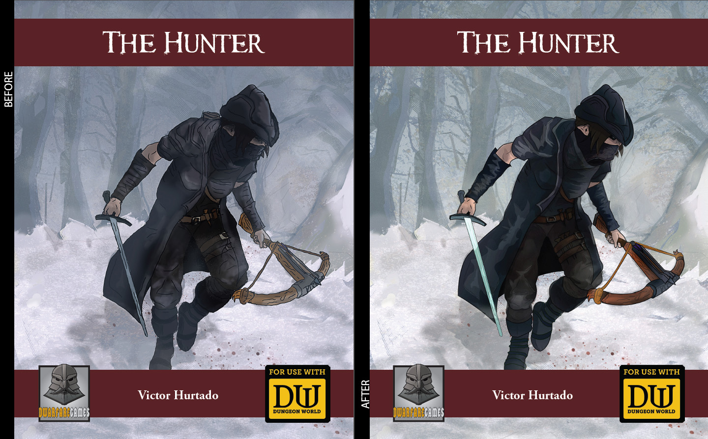
Since The Hunter reached Best Silver Seller on DrivethruRPG, I decided to clean up the cover image and redraw some of the elements, mixing the old style with the new one. #dungeonworld
Since The Hunter reached Best Silver Seller on DrivethruRPG, I decided to clean up the cover image and redraw some…

Originally shared by Dwarfare Games
Since The Hunter reached Best Silver Seller on DrivethruRPG, I decided to clean up the cover image and redraw some of the elements, mixing the old style with the new one. #dungeonworld
Comments are closed.
I like the 2nd one better, the slight green tint plays nicely off of the figure being a bit tighter and with some warmer (brown) elements like the crossbow/leather.
I would love to see a blend of both. However, I do think that coloring on the ‘before’ one is better than the one in the ‘after’ one. For example, crossbow on the ‘after’ one sticks out too much because of its color.
Opinion on an artwork is meant to be subjective so take this with some grain of salt… hehe
Jason Bu You are right. The crossbow’s colors are too bright and force the eye to look at it first. Ill have to fix that!