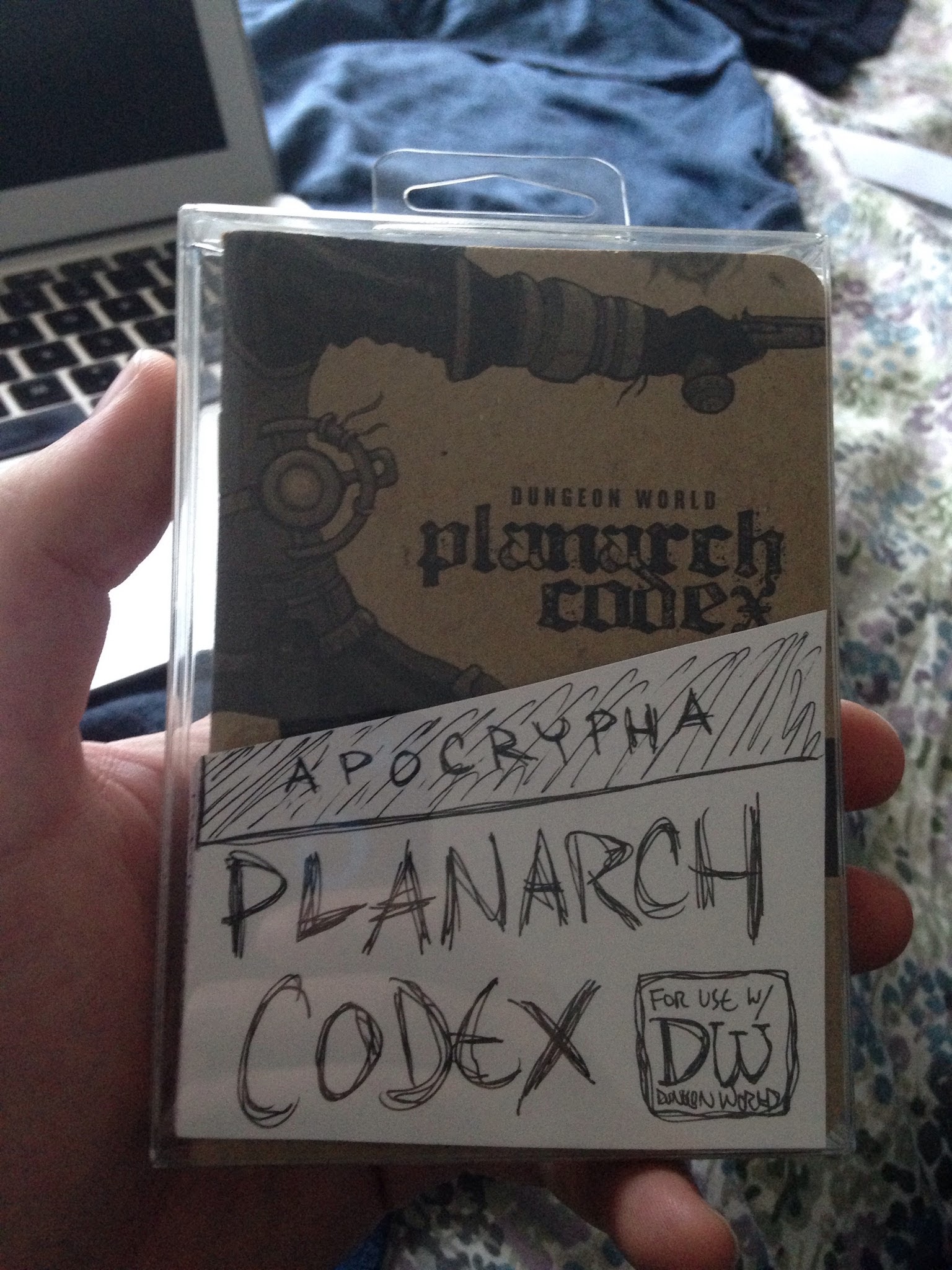
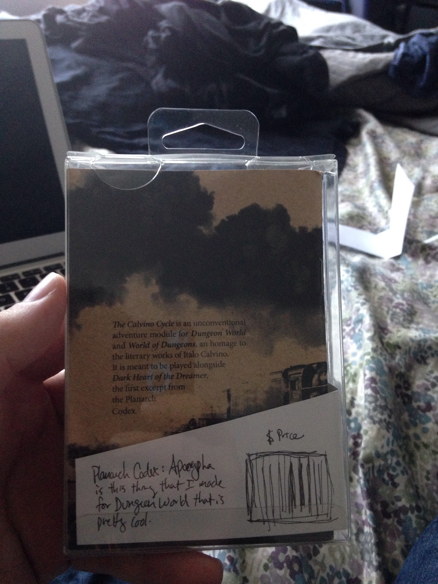
Experimenting with what the insert might look like. Suggestions welcome!
Originally shared by J. Walton
Playing around with packaging designs.
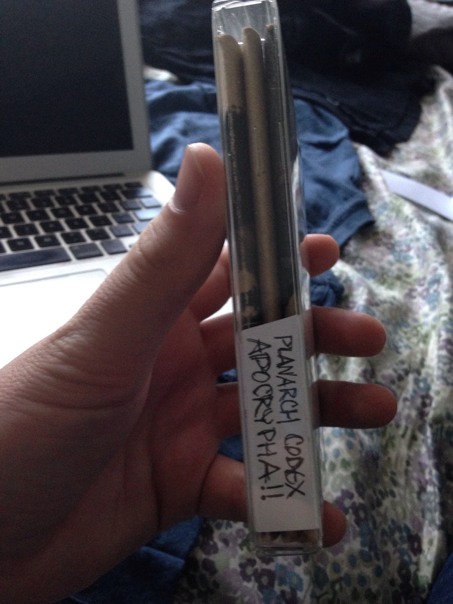

Experimenting with what the insert might look like. Suggestions welcome!
Experimenting with what the insert might look like. Suggestions welcome!
Originally shared by J. Walton
Playing around with packaging designs.
Comments are closed.
It seems really nice! 😉
Very cool. I like the angle. I wonder if you’ll use the insert card to cover / replace something specific on the covers of the first and last volumes.
I love it! I was going to suggest to use some graphic solutions to make it look like a fake “original” Calvino edition, but after checking on google it turns out 1979 Einaudi didn’t have much of a “graphic signature” 🙁
You could also play on the implications on the “Apocrypha” concept but wouldn’t know exactly how.
Could you get an artist to draw a dark cityscape as a backdrop to the insert title?