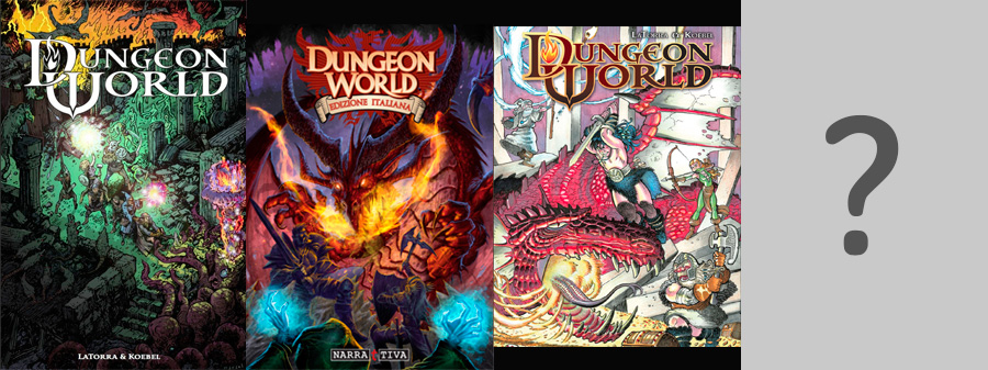
What “the perfect cover” of your ideal Dungeon World would look like?
I wonder the first image that comes to mind when thinking about Dungeon World. Please, share the link to the image that best represents your vision of the game.
What “the perfect cover” of your ideal Dungeon World would look like?

What “the perfect cover” of your ideal Dungeon World would look like?
I wonder the first image that comes to mind when thinking about Dungeon World. Please, share the link to the image that best represents your vision of the game.
Comments are closed.
http://i1295.photobucket.com/albums/b621/idontcareduh/busters/testfinal_zps0bc71478.jpg
Also a shameless plug for one of my favorite comics.
http://d.gr-assets.com/books/1382526171l/18711818.jpg
http://www.jimzub.com/wp-content/uploads/2013/12/Skullkickers-TreasureTrove3.jpg
Or…
http://i.imgur.com/pEa4ZXl.png
I personally love Nate Marcel’s cover. I have it as the background on my tablet and would LOVE to, one day, get a fully illustrated version of #DungeonWorld with only his drawings. I completely dig his style.
or…
http://2.bp.blogspot.com/-oGUQZ1G4u7k/UQwIarOHy7I/AAAAAAAABD8/6XoI1D4QHbE/s1600/Landscape.jpg
The DW Tavern logo of the crest is my favorite.
I love the Italian version.
Italian version
Both the original and the Italian one.
The Italian version by Daniele Orizio is awesome!
Nate’s is my favorite, but the other editions are great, too.
The image that comes to my mind is: http://1.bp.blogspot.com/-HBjhEtsyup4/UmA5fMxJ4tI/AAAAAAAAC1o/h-SdPrh4Vmw/s1600/AoD2.png
(and yeah, I ran that DW series)
The cover art to Eberron with the airship and lightning rail and warforged.
Just slap the DW title on there and you’re ready.
Don’t forget the coming 2nd french edition, with Nate Marcel’s second part of original illustration 😉
http://fr.ulule.com/dungeon-world-2e/
Oh wow, more Nate! Beautiful.
The first one, without a doubt. Something in a basic, simpler art fires the imagination. It inspires me.
Third one isn’t bad.
The second, Italian one, I really don’t care for. Not a fan of that style of art, which in my opinion is all too popular today. Not a fan of the over-sized weapons and armor that is depicted in a lot of fantasy art and games these days. Those types of things just look ridiculous to me. It’s like the shoulder pauldrons in the second pic. If that guy were to raise his sword above his head, those things would pop his head like a ripe and ready zit. As an old, and long time D&D player, I always hated the art of 3e, 3.5e, and PF. I can’t even stand to look at those books. Never could stand to look at WoW either because of that. But that’s just me. My opinion.
A matter of taste of course, but, to be fair, I don’t see any correlation between the D&D art (which I don’t like) and the second one. It’s not realistic, it’s not supposed to, it’s just very comic-like. To be honest, none of the three is realistic.
I was being fair. I made it clear it was my opinion. And I never said anything about “realistic”. The turn-off to me is more about practicality, or rather the lack of it, more than it being about realism.
I like a lot of different art. The thing I like about the simpler art, and a lot of the old inked art from early D&D books, is the they spark my imagination as my mind fills in the detail. But I like a lot of detailed art too, realistic or not.
My issue with art like that in the second cover, and the art I called out in my post, is the impracticality of the equipment in them. I also do not like art with disproportionately sized body parts which often accompany the aforementioned equipment. It’s just a personal taste. Those types of things stand out to me and my distaste for them do not let me appreciate anything about the art. I’ve no doubt that many, many people (especially among newer generations of role players) find characters depicted in that style of art to appear “bad-ass”. Where they simply look silly to me.
But I guess to be truly fair, there is some impractical art I do like. I do enjoy a lot of fantasy art depicting heroines in “chainmail bikinis”. Even if it is sexist. Again, it’s just a matter of opinion. Beauty in the eye of the beholder and all that.
If I could pick anything? Something by Frazetta, like:
http://fantasy.mrugala.net/Frank%20Frazetta/Frank%20Frazetta%20002.jpg
OR
Something stylized, but more abstract, like:
http://raysheaf.deviantart.com/art/Dungeons-and-Dragons-358504604
OR like the old concept art from early Final Fantasy titles:
http://i.kinja-img.com/gawker-media/image/upload/s–vGXLCXag–/17pi1l7xj1h5zjpg.jpg
So… something that’s cool, but off the beaten path of what typical rpg art is these days.
I think Frazetta has always been one of my favorites. Also like Boris Vellejo, Michael Whelan, Brom, Keith Parkinson, Larry Elmore, Tim and Greg Hildebrandt, Luis Royo, and Clyde Caldwell.
If I were a zillionare? Vance kovacs would sign the art from cover to cover.