The cover (without the new logo) and some art from the Polish edition of Dungeon World.
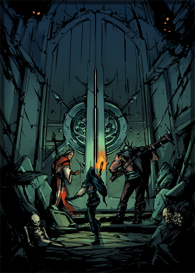
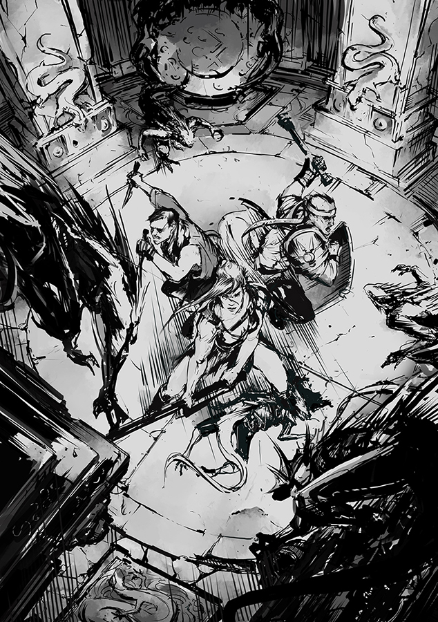
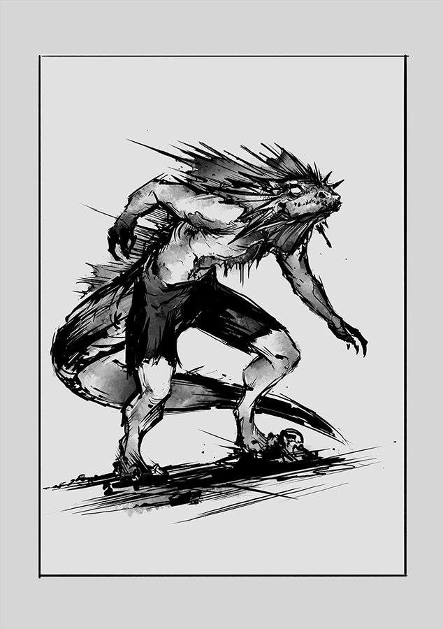
The cover (without the new logo) and some art from the Polish edition of Dungeon World.
The cover (without the new logo) and some art from the Polish edition of Dungeon World.
Comments are closed.
These are gorgeous
The are quite good
The PL version will be released by Gindie. The art is made by Kasia “Kolsga” Świderska (https://www.facebook.com/kolsga/?fref=ts)
So yeah, I would totally pay good money for an Art of Dungeon World book that collected art from the various international editions. Just saying…
I really like the art from the Brazilian Dungeon World Guide:
drive.google.com – Guia do Dungeon World.pdf – Google Drive
Instantly become my smartphone background image.
Marshall Miller I could see a kickstarter for a deluxe version of the English rulebook that has art from all the versions to fill out the art more.
Who’s the artist?
Oli Jeffery Kasia “Kolsga” Świderska (here is her fanpage: https://www.facebook.com/kolsga/?fref=ts)
Simon Piecha Thanks!
Wow. Really cool style. Also, I think that a specific art style can do A LOT for a RpG system. This transmits a serious, gritty, epic tone.
Take, for example, this picture from the italian version:
i.imgur.com
This gives a totally different feeling, childish, toonish. I think that art can heavily condition the mood at the table, suggesting to GM and players a precise kind of fantasy.
Or the German version, which is super regressive in my opinion:
https://i.imgur.com/GRfbijy.jpg
Splendid art !
Now I kind of want a play aid with color prints of the different covers. Slap that sucker down on the table and ask the players to point to the tone they want to shoot for in the game!
I’d be interested in a cache of all the various covers. I’ve heard the French one is cool.
Andrea Parducci You’re absolutely correct! I’m leading the Polish project, and I’ve spent a lot of time figuring out what atmosphere we should transmit with our art. I find art from many editions of DW a bit too “goofy”, “toonesy” and bit childish. I’ve always turned to more dungeony-epic fantasy type of DW play, so to stood out from others i decided we will go more gritty-fantasy (but not too dark and grim) with ilustrations.
Italian edition:
plus.google.com – Photo – Google+
Possible French cover (unverified):
http://i.imgur.com/yS2wmjo.jpg
I confirm it is, Yochai Gal
It’s the second part of Nate Marcel’s quadriptych.
More than that, my old AD&D dwarf character is pictured on the bottom left corner 🙂
https://lh3.googleusercontent.com/5bZ6FMxT3i7gUjt8XMRUDo4RCn8NVJ7c1bLwD2q0IZj-GmM0A3irZd5OwQGA44r94a1YF9s0NErFVg=s0
That looks smashing!