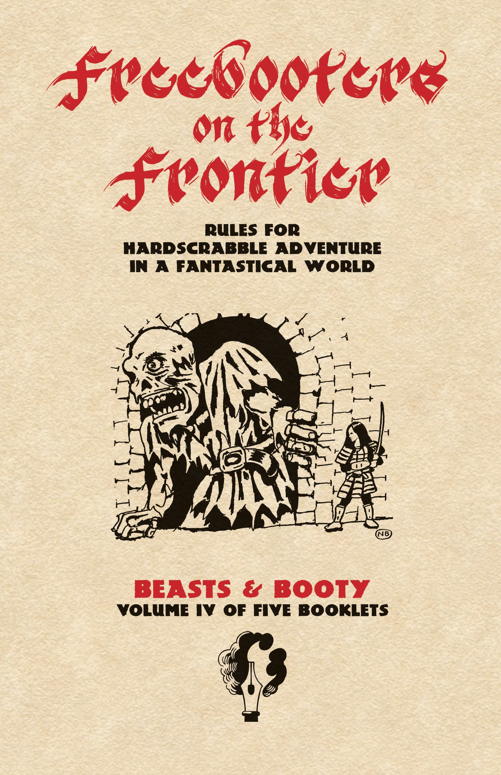
Just threw this together before running off to class. Too on the nose? Open to other title font ideas, this is just the best one I had on hand. Image is placeholder.
Just threw this together before running off to class.
Just threw this together before running off to class. Too on the nose? Open to other title font ideas, this is just the best one I had on hand. Image is placeholder.
Comments are closed.
I think the overall design is great! I’m not sold on the “Freebooters” font. I don’t think you can be to on the nose with an homage 🙂
Yeah the font sends mixed signals, “is it supposed to emulate print, or calligraphy?”
I like the title don’t. It’s nice that you’re emulating the LBBs, without trying to clone them entirely.
(Also I had to look up hardscrabble, and I think I’m falling in wordlove.)
I’m probably in the minority, but I like the indie-comics-zine look of FotF1E more than a retroclone look. Depends on who your main audience is, I guess. There are so many OSR-y hacks now, though, that it might be worth standing out from them a bit, even if you make references to OD&D. Maybe draw on the field manual / Boy Scout pamphlet look, to signal wilderness adventures? Not sure.
I LOVE the Freebooters font against the parchment background. Maybe a darker red, or faded? The other font: not so much. I feel like there needs to be a left hand margin too – even if its incorporated in the Illo, (as with PW).
I like it, please either both Roman Numes or both numberwords.
I’m with J. Walton in all respects. I especially like the Boy Scouts idea.
I would have a hard time dropping the aesthetic of my beloved white box — those books were the killer indie zines of their time! But I will consider it.
Retro look is fine as far as I’m concerned, but I do like the cover of FotF 1e better. I don’t care for the Freebooter font on this cover however.
Take 2. Art is placeholder.
https://lh3.googleusercontent.com/Rn-HoiAl9cwYdhcB_0p7-29DSulGjSfbq-eSFvR15-VWOfmhda_LCRVBsVDGQzeDUJiDrXdioP1ftrPIA-2kGlAj634qiJJxY_M=s0
Front cover by itself:
https://lh3.googleusercontent.com/06KMkv0pCUF62nF-f5knb1uywUhM3p2vP0XJ49BkO_r676qXDp-IzrIaspovU71Hmmt477COmYskbw5eYY9Aqv-V8qZyryDIuoM=s0
Very cool. I like this hybrid version a lot. Let me know if detailed nitpicks are useful/desired.
Yes! Do that!
I really like it too – especially the red text under the black shading, and the title font is great. I would suggest keeping the whole party of adventurers visible – the cover looks a little awkward with just the one guy there. And I’m super pleased that you’d be keeping the original art!
I think this works really well!
J. Walton, nitpicks welcome! Just throwing things together atm.
David Perry, this art is just placeholder. All of the covers will have new, original art. If I go this route, I’ll be asking artists to create thematically appropriate wraparound images for each of the five booklets, composed such that when they’re “torn” the important/good stuff is visible.
You already picked my main nit, which was also about that one adventurer dude.
I think this is great! Let me know if you want to see it in some alternate fonts!