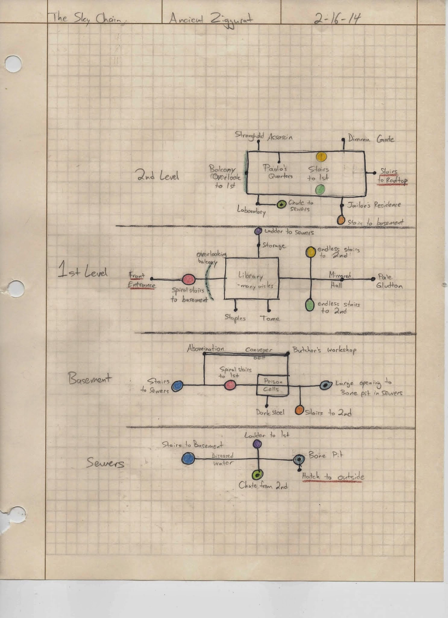
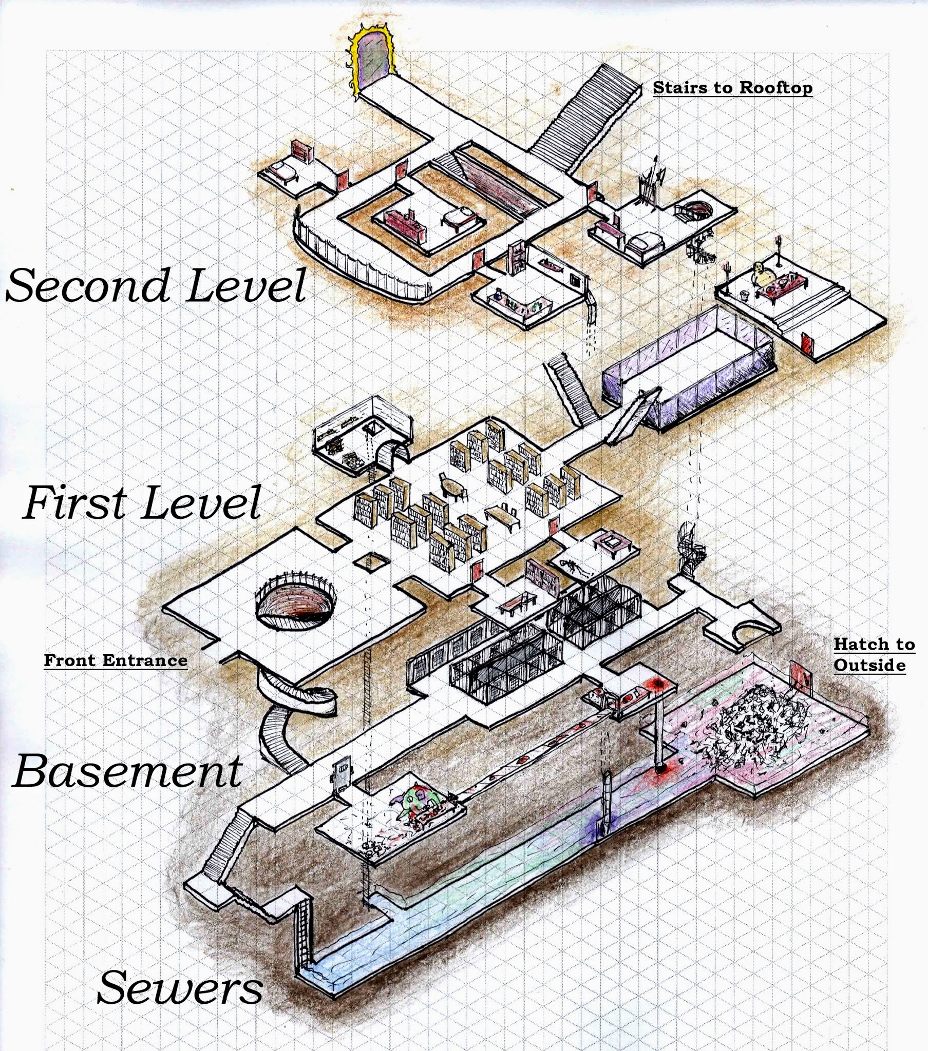
I attempted an isometric representation of a dungeon I made and ran a month ago. The first scan is the map I used running the game, and basically matching colors means the floors connect through it (stairs, ladders, chutes). I think I do a decent job at improvising descriptions of areas, so a “flowchart” style map suffices for me. It’s also easy to edit and add on stuff.
The second is done on isometric graph paper in pen and color pencils. Labeling is kept to a minimum for the sake of clutter. And I had to change a few orientations so everything fits and hopefully makes more sense.
The campaign was initiated with the Dungeon Starter “The Sky Chain” by Marshal Miller. After the first session I came up with some fronts, one of them being the ziggurat, a floating construction in the sky.
I was inspired by this article on Jennell (Paul) Jaquays to make multiple entrances and connections between areas.
http://thealexandrian.net/wordpress/13085/roleplaying-games/jaquaying-the-dungeon
The adventurers only went through half of it before leaving (but hey, that’s the point!). They explored the basement and some of the 2nd level, but pretty much skipped the 1st level.


looks cool well done!
I always have to explore every square inch. It would be impossible for me to leave any bit of a dungeon untouched. Great design, the isometric looks very cool!!
Where did you get that paper for the isometric design?
I googled it and printed one. Don’t remember which specific website.
Alright. I found this if others are interested:
http://www.waterproofpaper.com/graph-paper/isometric-graphing-paper.pdf