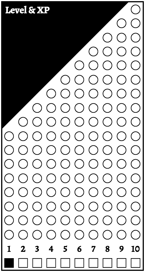
Would you want a Level/XP “widget” like this on a character sheet rather than the traditional blanks? Would you “widgetize” xp differently?
Would you want a Level/XP “widget” like this on a character sheet rather than the traditional blanks?

Would you want a Level/XP “widget” like this on a character sheet rather than the traditional blanks? Would you “widgetize” xp differently?
Comments are closed.
I love coloring dots in, so yes
That’s a lot of real estate for pretty shallow information that I don’t find especially interesting, but it would save a lot of erasing, so… maybe. If I did, though, I’d rotate it so you’re filling in bubbles from left to right instead of top to bottom. Top to bottom feels weird, like it’s growing in the wrong direction.
I’d run 125 boxes in a single column up the side of an 11′ piece of paper. It’d be a little less than a 1/10 of an inch high per box. At each level mark, I’d put the number along side. People would fill from bottom to top, forming a single solid bar, and circle the level once they get there / make the move.
Basically, it’d be like a height chart as your character grew up, and would take a lot less real estate.
Tons of wasted space for me.
At each given level you got past information (cross dots) who dont serve any purpose and future information (blank ones) that will be helpful someday but not now.
Perhaps just one column of dots… but i really prefer a little place to put marks, and use the space in the sheet for really useful things (equipment, clues, information, NPCs, places…)
I like the idea a lot, but I think Ryan Abrams implementation is much better as it would save so much space 🙂
No.
I’d like that but it seems it would take some precious space. I really like the layout of the official playbooks. For example of you were to fit it in the official playbook, where would you put it?
What about having only 10 circles and having a square for “tens”. I would also reuse the range circles each level by erasing the check marks in them after leveling up.
Hardcoding the XP-per-level into a character sheet makes it harder for a game to house rule the advancement rate. Or, if they have house ruled it, they’re not going to want to use this version of the playbooks.
Aside from that: I like Ryan Abram’s version; the “steps” approach takes up too much space.
I like the idea. No caveats, no adjustments, just straight up like it. Dungeon World sheets have very little info in my opinion (I’m used to Pathfinder and Shadowrun, where you don’t have a sheet but a booklet), so something like this would be fine.
Only thing I’d want to see changed, and this was after setting and looking for something for a few minutes, would be to make the black space white so you could put notes or a picture there.
I like that widget. Very graphic.
Plus, dots.
Thanks everyone for the feedback. Obviously I’m working on something but it’s not fully baked yet. I’d considered Ryan Abrams idea and agree that it’s the most space efficient but it doesn’t mesh with some of the other things that I’ve got cooking. Oscar Iglesias, I really appreciate your comment—gave me a different perspective on the design. Also really appreciate Jeremy Strandberg’s comment about house rules. Something I hadn’t thought about but should have.
It’s nice, but not really for me. It would just take up too much space. I use an OpenOffice template that I made to create new sheets for players since we make use of the Class Warfare supplement for DW. I also use Luck from Freebooters. My problem has been trying to use as little space as possible to keep it down to one page sheets (not including spells sheets).
When I do have extra space, I prefer to place something more along the lines of character portraits on the sheet.
I’m thinking more like a VP track on boardgames would be good. A border around the entire sheet with marks at the level increases.
something like this- https://drive.google.com/open?id=0Bx9hFiV0gL5zSk5kbldJODVkU0k
Photoshop source (for making neater version) – https://drive.google.com/open?id=0Bx9hFiV0gL5zX0drT1R2d1dNQzg
Peter Cobcroft It’s actually better looking than I though it would be. It looks like small runes along the sheet 😛
I’ve always found it’s best to come up with a visual, no matter how error laden and rough, when proposing design ideas – it’s much easier to explain a visual idea with an image.
Well, I actually showed this to one of my players who came by for a visit while I was looking through some Google+ stuff, and he liked it. So I’m going to show it to the rest of my players. If they like it as well, I’ll compromise with them and print the widget on 4×6 index cards that I can hand out at the end of session, or that they can keep with their sheets.
Hey, if it’s a funner way to do XP? Why not? The more fun to be had, the better. And it’ll actually save a little room on the character sheets.
Just for your info, older “WIP” edition of DW included such a thing in their playbooks. Look at top right of the sheet.
https://drive.google.com/file/d/0B8_Fz4m5hcoiOGRnU1V2MzhPWUk/edit