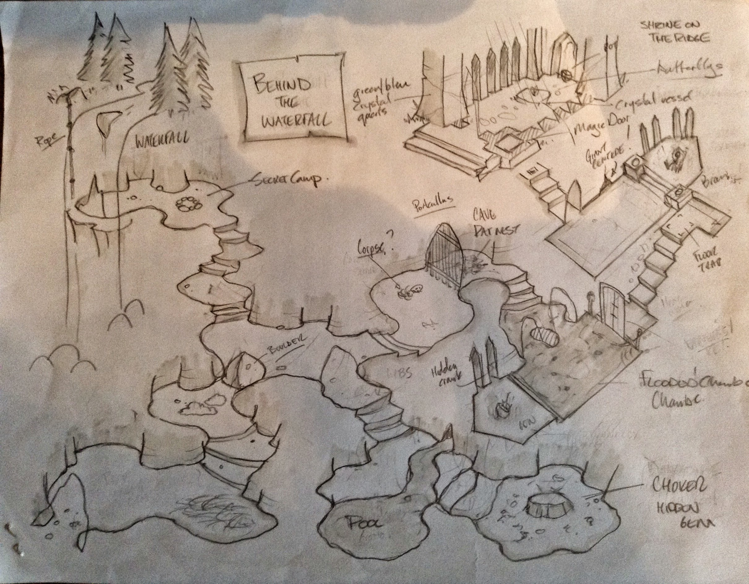
Here’s Behind the Waterfall in its entirety.
This dungeon was the first I used under Dungeon World.
Here’s Behind the Waterfall in its entirety.

Here’s Behind the Waterfall in its entirety.
This dungeon was the first I used under Dungeon World.
Comments are closed.
Well, that’s a pretty awesome little map. Nice work.
Very nice, shows a practiced hand I’d say!
That’s a nice boulder. I like that boulder.
I really like this style, very nice.
Yeah, that style is great. Kind of isometric, but with some areas flattened out for easy use. That would look awesome on parchment paper. Really nice.
very nice
I agree with HyveMynd: Parchment paper with a touch of really muted watercolours from a real limited palette. Something like two or three colours, no more. That’s not to say it doesn’t look awesome as is…
Yup. I’d totally buy an artbook of maps done up in this style.
maybe you should consider doing a collection of map designs similar but completely diffrent to this one as well and attempt to spread the love via selling them, i’d invest.
really nice!
Angel Feliciano, one day maybe I’ll get around to packaging everything I have and putting a price tag on it, but for now, it’s still a hobby, so I’ll share for free!
Seriously inspiring map!
This is how I also do my dungeon world maps. Since you don’t need a grid, it looks so much nicer! We still use tokens if necessary.
beautiful map. Looks timeless.