14 thoughts on “First attempt at a cover for issue #2.”
Chris Sakkas, obviously.
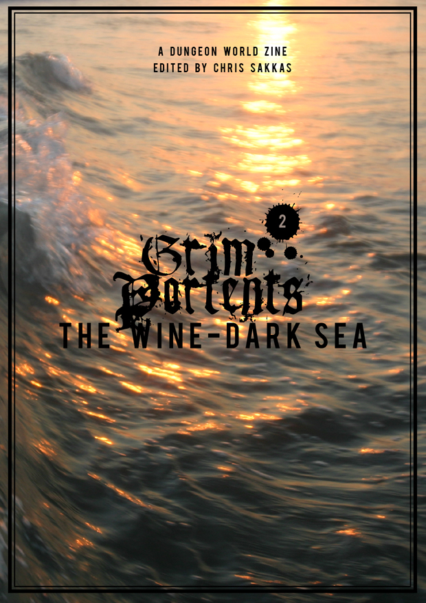
That’s purty
Very pretty! Text is a little tricky to read in places where it’s on the dark water rather than the sunlight one (although of course you can pick it all up from context).
Nice.
Very nice! Now I just have to remember to get my submission in on time…
Looks great! I agree with Ben Wray that it could be a bit hard to read in parts.
Cool. I can lighten the background or throw a gold outline around the black text.
Gold outline seems like it would work well.
I like the combination of rosy-fingered dawn (or dusk) and wine-dark sea.
Damn I owe a review of issue one still! Agreed on the gold outline.
What fonts do you use?
Ben Wray Like National Geographic? Sorry, showing my age, NatGeo…
Jonathan Walton Any color stroke around your letter will fit (red, gold, light blue, orange…)
Marshall Miller You’re not that old, aren’t you ? 😉
I like it, although i’d color shift the light a bit more rosy. Give it a ‘wine’ tint per se ^_~

Chris Sakkas, obviously.
That’s purty
Very pretty! Text is a little tricky to read in places where it’s on the dark water rather than the sunlight one (although of course you can pick it all up from context).
Nice.
Very nice! Now I just have to remember to get my submission in on time…
Looks great! I agree with Ben Wray that it could be a bit hard to read in parts.
Cool. I can lighten the background or throw a gold outline around the black text.
Gold outline seems like it would work well.
I like the combination of rosy-fingered dawn (or dusk) and wine-dark sea.
Damn I owe a review of issue one still! Agreed on the gold outline.
What fonts do you use?
Ben Wray Like National Geographic? Sorry, showing my age, NatGeo…
Jonathan Walton Any color stroke around your letter will fit (red, gold, light blue, orange…)
Marshall Miller You’re not that old, aren’t you ? 😉
I like it, although i’d color shift the light a bit more rosy. Give it a ‘wine’ tint per se ^_~